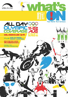
As the design on my front cover and contents page is almost complete, I decided to add my evaluation of an exsiting student magazine.
Here is a university magazine aimed to inform there students what is going on in and around the campus. Current affairs are also included and the main topic of that time was the Olympics. As a student union it's focusing on what is available to the students, bar offers etc.
The banner is bold and states the obvious, it's brand identity is it's logo in the top left hand corner and allows you to see the union it belongs to.
The few coverlines that it does include are kept to a minimum and are situated on the right hand side of the front cover as well. The graphics co-ordinate with the magazines main feature ( the olympics). The strapline entices you to read further and find out what you can about the events and the font is kept in similar styles so it's easy to understand. The layout of the magazine allows the pictures to do most of the talking, showing the reader the spectacular sport events that they can witness. These pictures have been edited to highlight particular aspects of the movement taking place. I believe this magazine ticks all boxes when it comes to enticing a customer to purchase it.
No comments:
Post a Comment